Showing posts with label the missing ink. Show all posts

Thursday, December 8, 2011

Manic Mon-... Thursday!

Welcome back to my artblog. I've slowly but surely gotten this thing back up and running. Drop me a line, leave a comment, all caps and really angry if you want... I love it all!

It's Manic Mon-... er, Thursday now. There's art to get done, comics to be read and a kid to be entertained. Let's get this show on the road!

---------------------------------------------------------------------

I finally got around to watching "Horrible Bosses" this week. We had a free evening (what with the kid having a sleepover with her meme) and we had a nice meal, and wanted to have a low-key movie to round out the evening (Melancholia, which I do want to see, was naturally discounted). I'd heard good things about "Horrible Bosses" so we decided to give it a try. It was entertaining, and I think the whole cast did a great job. Colin Farrell, Jennfire Aniston and Kevin Spacey all did great jobs as the 'bosses', and Aniston in particular did a hilarious job with the script that was given to her. I'd recommend it if you're looking for an easy, entertaining comedy.

---------------------------------------------------------------------

Rolling Stone has now come out with its annual list of Best Albums and Best Singles for 2011. Predictably, Adele is topping both of those lists. I can't fault "Rolling In The Deep" at all; that song rocked and had some major staying power. The album itself I haven't listened to enough to judge whether its top spot was worthy or not. Thoughts?

---------------------------------------------------------------------

It is cold lately! Well, for San Diego anyways. Just sayin'.

----------------------------------------------------------------------

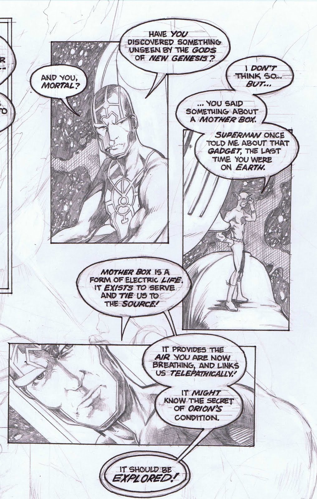
Second round is up for Comics Should Be Good's The Line Is Drawn Tryout! (Holy Crap in a basket, that's a mouthful) (That's what she said) ....Sorry, too much coffee there.. .Anyways, yeah, go check it out. My contribution to this week's theme of Mash-Ups is The Spirit meets Batman (specifically the old cranky Bats from Dark Knight Returns). The voting is happening here.

Go vote for me! ...Please?

----------------------------------------------------------------------

Speaking of the Spirit, in looking for reference I stumble upon this awesome article discussing the way-ahead-of-its-time title modifications of the book by creator Will Eisner. It's a great article with some phenomenal art. Go get your art on.

----------------------------------------------------------------------

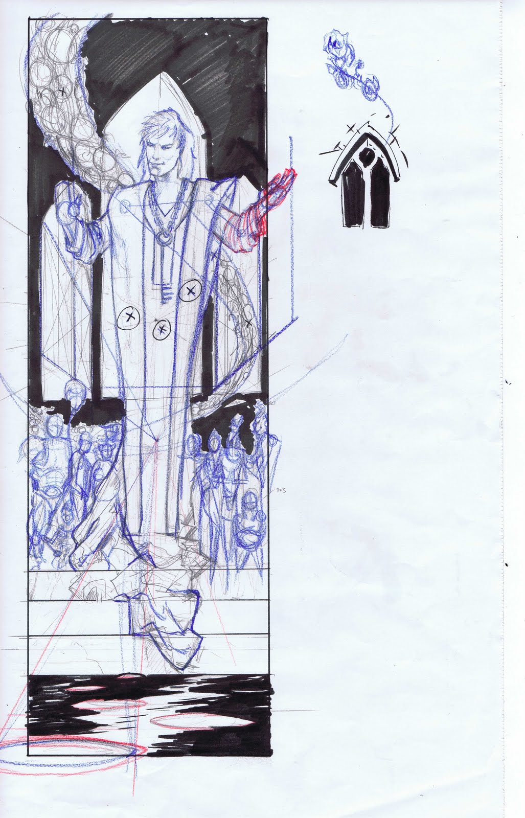
Speaking of art, here's the aforementioned Batman/ Spirit piece. Lots of fun with this one.


See you tomorrow!

Wednesday, November 30, 2011

The Missing Ink


It's the Missing Ink! Yeah, it's been -ahem- missing for a bit (along with the whole blog really). But it's back! I've been working on something that I'm not really supposed to talk about yet, but I just finished a patch panel and I thought I'd share it with you fine folks!

Anyways, here it is. The penciler is Jeff Edwards (his DeviantArt page is here) and as you can see, his pencils are pretty damn tight. Still, he's left a little bit of wiggle room, for one; and also, throughout our working together we reached a point where I'm comfortable pushing some stuff and adding little bits here and there. (The penciled panel looks wider because of the trim line, which I left in)


Hopefully I'll be able to talk more about this project soon. Regardless, glad I could share this little bit with you.

See you tomorrow!


Wednesday, July 6, 2011

The Missing Ink

It's the Missing Ink! Yeah, it's been -ahem- missing for a bit. But it's back! For the last few weeks I've been posting updates abut a small comic I was doing for the ACLU. Fun stuff. Much different than what I usually do, but that's the fun of something like this.

Anyways, it's all done now and I thought I'd go ahead and post it in its 'raw' state; raw of course meaning that the logos aren't in place nor a band of graphics runnning along the background of the upper right quadrant.

I really enjoyed the inking. Knowing it needed to be easily read meant I needed to not get to fussy with it. Kept me honest.

Anyways, here it is.

See you tomorrow!
-----------------------------------------------------------------------


Friday, April 22, 2011

New Gods Update! (The Missing Ink)

So, here's an update on the New Gods page I've been working on. (The roughs for this bit of it can be found here )

The lettering turned out great, if I can be so bold; you can tell by the roughs that, for this page, I really considered it a crucial part of the layout. The 'fun' of this has been the roughs (a lot of quirky storytelling challenges, many self-imposed) and the lettering (which helps overcome some storytelling problems and is just plain entertaining). It's a bit of work now to get to the finish line with this one, but I really want to see this done (not always a given) so rest assured true believer...done it will be!

Soon.

----------------------------------------------------------------------

The Missing Ink!

Well, it's Friday, not Wednesday, but I finished this piece today and so it's going up now.Our penciling selection for this installment of "The Missing Ink" comes to us from Phil Jimenez. Phil (I had him as a teacher, and we're Facebook friends, so I can refer to him by his first name if I want! lol...) is known for a wide berth of projects he's worked on (Tempest, X-men, Infinite Crisis) but he's probably best known for his run as writer and artist on DC's Wonder Woman.

Phil's work is very line intensive, detailed and carries with it a great deal of emotion, even in this piece, which is theoretically a skecth. I'm not sure where I pulled this Wonder Woman drawing from; I found it online and that's about all I know of it. Ask Google!

------------------------------------------------------------------------

Working on this (the first time I've tried inking Mr. Jimenez) I realized that I would need to switch things up. Usually I'll ink hair in brush, not nib or pen; this makes sense, as you generally want the organic, soft line of a brush for something soft and organic. However, I started inking with the brush and realized that the sketchy line (it is a sketch, I guess!) needed a line that would firm it up a bit and give it a solid volume. I switched to nibs and pens, and I'm glad I did.

I think it turned out alright! (Phil's pencils are on the left, and my inks are on the right)

Wednesday, March 30, 2011

The Missing Ink

As I wrap up my Sandman page (to be posted tomorrow) I thought I'd share a little bit more of my process.

-----------------------------------------------------------------------

Sometimes, even with an image 'clear' in your head and a rough that's pretty complete, I find that it can be helpful to spot some of the blacks. That's a little bit of comic talk there, sorry; basically, what I'll do sometimes (and what I've done with the subsequent rough) is go in with a black marker, and determine some of the black areas or shadows ahead of the penciling stage. I find this can add a bit of cohesion to a panel that's lacking it.

I thought this panel was working, but I thought a little bit more of an 'oomph' could be wrung from it if I went for a little more heavy contrast in the lights and darks. Figuring out these lights and darks ahead of time obviously makes a lot of sense. I shudder at working through some of these problems on the board!

------------------------------------------------------------------------


My initial rough's in lead (grey) pencil, second step's blue and some fixes in red. I was initially going to do a little brickwork or something to make the building these characters are in look like a building, but I decided that the characters themselves should be the focus, and so I've reduced everything to a stark black-and-white.

See you tomorrow!

Wednesday, March 9, 2011

The Missing Ink!

Get it, the 'missing ink'.

-ahem-

Welcome to another installment of my new and improved art blog. I'm your host Alonso Nunez. It's Wednesday and that means it's time to 'sketch' a nice bit of inking (hopefully a nice bit of inking anyways) over some pencils (usually by another artist but sometimes over my own).

This week's selection comes to us from John Byrne. It's from Rough Cuts #1. Byrne has been in comics for over thirty years now, and his work on Fantastic Four and X-Men are considered among the finest runs those books have ever had. He's also had stellar runs on Alpha Flight, Avengers, and Superman, which is where this piece comes from.

-----------------------------------------------------------------------------

This is a splash page from The Man of Steel #6. It's fairly tight, as you can see above. By 'tight' I mean that the lines are all pretty defined, textures are discerned and line weights are present. This is one of those 'just don't mess it up' type of drawings. I'm going to see if I can have a little bit of fun with it.

The original was inked by Dick Giordano, one of the greats, and can be seen here.


-----------------------------------------------------------------------------


This was a lot of fun. A good inking exercise. I used only brush on this one (except for the 'S') and tried to just speed through it, reach for something a bit more spontaneous and organic. Like I said, fun.

Wednesday, February 9, 2011

The Missing (L)Ink

So last week, what with a million things and a planned trip away for the weekend, meant that some things fell through the cracks, or slid forward a bit. One such thing was my Supergirl turnaround, which was just finished yesterday, and its companion Batgirl.

I'm adding an "L" to today, and switching (temporarily) "The Missing Ink" to "The Missing Link". I'm fast-tracking my Batgirl turnaround so that I can keep those sample pages on track. Ladies and gentlemen, Batgirl!

-------------------------------------------------------------------------

This is not the Batgirl you know. It's not that one, either. This is a new Batgirl, who was first introduced as such in 2009. She's been around for a little while though, first introduced as the Spoiler in the 1990's and temporarily subbing as Robin a few years back. The new Batgirl is a pretty cool character.

Her costume? Let's see...


---------------------------------------------------------------------------


Um... wow. This is a really complicated costume, isn't it? You've got the traditional Bat-elements: the cowl, the cap, a utility belt, the emblem. But then, man, you've got a lot layered over and around it. There's a kevlar-type ribbing along the outside of the chest and upper legs and the inside of the arms, an extra pouch on the leg, a weird body armor upper chest thing that the cape attachs into. I just drew the thing and I can exactly picture what it should look like!

Batgirl's had some really classic looks over the years, and while this has some beginnings, it isn't one. (I do like the way the drawing turned out though) Or am I just crazy? Is this a good costume?

See you tomorrow!

Wednesday, February 2, 2011

The Missing Ink (and color, too!)

The Missing Ink (get it?) is a day where I usually post some ink work that I've done, side by side with the original pencils, which are sometimes by me and sometimes by other artists. This week is going to be a little different though.

----------------------------------------------------------------------

I was approached last...fall? summer? I forget... to do a pinup for a Voltron art book. It's called Voltron: United and Drawn and it's out as of the end of January. It was a fun project to do. I loved Voltron when I was a kid. The show is roughly divided into three teams: the Lion Force, the Vehicle Force and Gladiator. I don't really remember that last one. Anyways, I decided to do a 'quiet' piece (basically one in which there's no dramatic action). It just seemed like a much more fun approach to take with the art. I chose two characters, Pidge and Chip (one of whom is on the Lion Force, the other on the Vehicle) and just had them kicking back and enjoying Voltron's celebration.

----------------------------------------------------------------------

This piece really called out for some color too, but I am no colorist. I can try and maybe stumble on something workable, but this needed to shine. Enter one of my friends from the School of Visual Arts. David Fernandez is an incredibly talented colorist, in addition to being a really good artist in general, and he was able to make some time to color it.

His coloring? Basically, it took the piece from a triple to a grand slam. It's really good. I got it back and kinda didn't believe I had drawn it. A million thanks to David!

First is the black and white version, followed by the colors. Please stop by David's blog (here) and tell him how much the colors rocked. David's also on Deviant Art (here) where he also has a ton of great work that he's done.

------------------------------------------------------------------------

Wednesday, January 26, 2011

The Missing Ink

The Missing Ink is a chance for me to do something inking, whether it be over my own pencils or over some pencils of a different artist. This week is a bit of a catch-up week for me in other areas, so I'm showing off something that's a little older. This is a inked piece I did over artist extraordinaire Jose Luis Garcia-Lopez about two years ago now.

-----------------------------------------------------------------------

Jose Luis Garcia-Lopez is a great artist blah blah blah, genius, master, "forgotten more than I'll ever now"... all that stuff. He's also incredibly fun. Check out this page. There are so many ways to draw Superman battling some villain and Wonder Woman swooping in. Check out that Wonder Woman in the last panel though. I swear, no one draws WW like Garcia-Lopez. No one.

That was obviously the focus of the page, and needed to be the focus of my inking. This isn't to say that the rest of page didn't matter as much, just that the last panel needed to matter the most. That's a slight difference, but one that I feel is pretty important in inking.

There's some spots I'd go back and fix up now, in hindsight. I'd approach the grey tones a bit different in the first panel, and I think I lost a bit of the Garcia-Lopez look with Superman's face in panel four. I do think though that panel two came out well, and I stand by that Wonder Woman figure.

Hope you like it. They'll be some new stuff next week, promise!
(First up is the pencils by JLGL and then the inks by yours truly)

-------------------------------------------------------------------------

Wednesday, January 19, 2011

The Missing Ink!

Get it, missing ink?

Today is going to be a little different, and a little brief. I've got a lot of work that I'm trying to catch up on for various clients, and I'm not doing a comic inking piece this week.

I thought though that I'd show you a little process work for one of the jobs I'm doing right now.

---------------------------------------------------------------------

I'm currently designing a logo for an adjunct business for a catering company, and it's decided that it's going to be a silhouette. Silhouettes are tricky. They're maybe the easiest thing to draw, but then one of the hardest things to draw well. You've really got to convey the point of the picture with just the contour.

One of the things I do when I'm doing silhouette work is get acquainted with the subject by doing quick drawings, but by drawing only with pen. I find that I can start to choose my lines carefully at this point and preemptively stop myself from getting too concerned or wrapped up in any detail work. Just the facts, ma'am.

Here ya go!

Wednesday, January 5, 2011

The Missing Ink!

Get it, the 'missing ink'.

-ahem-

Welcome to another installment of my new and improved art blog. I'm your host Alonso Nunez. It's Wednesday and that means it's time to 'sketch' a nice bit of inking (hopefully a nice bit of inking anyways) over some pencils (usually by another artist but sometimes over my own).

------------------------------------------------------------------------

I will never, ever get tired of doing inks over Jose Luis Garcia-Lopez. This week is a Superman piece by him, the other part of a page from which I got another Superman that I did about a month ago (that one can be found here). Pretty straightforward.

I do think this one turned out better than the last one. I was aiming for less; I wanted something more like an 'ink test', like the one I did a couple weeks back of John Romita Jr.'s sketch of Hellboy and Batman. There might be something in that...

------------------------------------------------------------------------

Wednesday, December 29, 2010

The Missing Ink!

Get it, the 'missing ink'.

-ahem-

Welcome to another installment of my new and improved art blog. I'm your host Alonso Nunez. It's Wednesday and that means it's time to 'sketch' a nice bit of inking (hopefully a nice bit of inking anyways) over some pencils (usually by another artist but sometimes over my own).

This week's selection is a continuation of last week and comes to us from John Romita Jr. I said it last week, but I'll say it again: He's really good.

....

Really, really good.

Take this piece for example. I talked last week about the compostition strengths and the storytelling, and also the inking challenges, yadda yadda. But look at this thing. JRJR probably knocked this thing off in about half the time that it's going to take me to write this post (never mind finsh inking!) and he's made it rock-solid cool.

------------------------------------------------------------------------

As I started inking this I realized that I wanted to treat it less as something I was trying to finish or complete, and instead treat it as more of an exercise. Romita Jr. is so solid that it's hard to go wrong inking him, but he's so energetic and 'rough' that it can be tricky to really get it right inking him. For my money, the two guys that have most gotten it right when inking Romita Jr. are Klaus Janson and Al Williamson. Williamson was JRJR's inker on a sustained and acclaimed run on Daredevil in the 80's, and Janson has been JRJR's primary inker for over six years. With good reason, in both cases.

Both artists managed to successfully keep the energy and kinetic movement and power of Romita Jr.'s pencils without losing any clarity or story cohesion. I wanted to try to reach for that same energy, but being nowhere near either Janson or Williamson I knew that I'd be losing some clarity or 'polish'. I decided to let that be okay. Omlettes, eggs and all that....