Wednesday, March 30, 2011

The Missing Ink

As I wrap up my Sandman page (to be posted tomorrow) I thought I'd share a little bit more of my process.

-----------------------------------------------------------------------

Sometimes, even with an image 'clear' in your head and a rough that's pretty complete, I find that it can be helpful to spot some of the blacks. That's a little bit of comic talk there, sorry; basically, what I'll do sometimes (and what I've done with the subsequent rough) is go in with a black marker, and determine some of the black areas or shadows ahead of the penciling stage. I find this can add a bit of cohesion to a panel that's lacking it.

I thought this panel was working, but I thought a little bit more of an 'oomph' could be wrung from it if I went for a little more heavy contrast in the lights and darks. Figuring out these lights and darks ahead of time obviously makes a lot of sense. I shudder at working through some of these problems on the board!

------------------------------------------------------------------------


My initial rough's in lead (grey) pencil, second step's blue and some fixes in red. I was initially going to do a little brickwork or something to make the building these characters are in look like a building, but I decided that the characters themselves should be the focus, and so I've reduced everything to a stark black-and-white.

See you tomorrow!

Tuesday, March 29, 2011

Turnaround Tuesday!

I started this one a few weeks back for St. Patty's Day, but various things got in the way. It's Banshee!

-----------------------------------------------------------------------

Banshee is one of the characters from the 'second wave' of X-Men which made its debut in 1974's "Giant Size X-Men" #1. (This group also famously included Wolverine, Storm, Nightcrawler and others) Banshee had made his debut in "X-Men" years earlier, as a hero forced into villainy by that dastardly Magneto.

He hung around for the first year or so of the 'new' X-men, but since then more or less remained in the background, or at least among the second tier of X-men.

-----------------------------------------------------------------------

There's a fine line when designing vaguely nationalistic heroes. You can get either the 'clone of Captain America' look (see Captain Canuck, Germany's Vormund or Russia's Red Guardian) or you get the 'stereotype of the country as a costume' look (see Saudi Arabia's Arabian Knight, Spain's Aguila or -oy- Ireland's Shamrock). I think that the later is much easier to get wrong. Just look at them! Shamrock's name is even Molly Fitzgerald! Why not just name her Leprechaun O'Guiness?

Banshee somehow managed to stay out of that stereotyped caricature of a country 'zone'. I think it's because his name implies a connection with Ireland, without any implicit 'banshee' imagery, and his costume, in its green and yellow color scheme, says 'Ireland' without knocking us over the head with explicit flag imagery. He also tended to have subtle character traits that said 'Irish': curly, red hair, longer sideburns and a pipe. He walks on that tightrope, but I think it works.

The costume itself is great too. You've got a streamlined costume with just a collar for distinction; he's a flier and needs to stay unencumbered. And those wings. Man, I remember loving those crazy wings ever since I saw him in a comic back in the early '90's.

Great costume. I think I did a decent job here. Join me tomorrow for more art goodness!

------------------------------------------------------------------------

Monday, March 28, 2011

Manic Monday!

It's Manic Monday! You may have noticed that the last couple weeks were a bit of wash here at Pop/Life. I bit off.. not more than I can chew, but a piece that took a little bit longer to chew, if I can be allowed to stretch that metaphor to its legal limit.

I started trying to get done an extra comic page, in addition to my blog stuff and my usual motley crew of assignments, and it's taken a little bit longer than I'd anticipated to integrate into my schedule. Let's see if this week we can get back on track, yeah?

----------------------------------------------------------------------

It's no secret, here on this blog or to anyone that's talked to me for more than five minutes, that one of my absolute favorite comic artists is Kevin Nowlan. Nowlan is a thirty year professional in the industry, and he's one of those rare talents that's on the short list for mastery of penciling, inking, coloring and lettering. He's really, really good.

It's pretty rare anymore for him to take on penciling jobs (he's spent more time doing covers and stellar inking jobs over guys like Jose Luis Garcia-Lopez) but Mike Mignola, creator of Hellboy, has somehow lured him into doing a Hellboy one shot. This highly anticipated book is due next month. Kevin Nowlan's really gone all out on this one: he's doing the pencils, inks, letters and colors. I'm incredibly excited. Yay for comics!

There's a brief but interesting article over at Newsarama on the project (and dig those sweet pencils!)

------------------------------------------------------------------------

I don't know what I'd do if I didn't own an espresso machine, I really don't.

Okay, that's a lie. I'd go to the excellent Lestat's Coffehouse, here in Normal Heights. I'm just a block away, and I feel lucky.

-------------------------------------------------------------------------

I'm always interested in how other artists produce their work, and what steps they take and when. Along those lines, there's a great process article about a recent Venom cover by Joe Quesada over at Comic Alliance. Go check it.

-------------------------------------------------------------------------

So, the Sandman page I promised on Friday is not done yet. BUT. I've got a nice looking panel to show you! Last week (or the week before that, really) I posted a rough I was working on for the page. Well, the pencil-ness is done for that one. Here ya go!


See you tomorrow!

Monday, March 14, 2011

Manic Monday!

It's Manic Monday, and I'm somehow caught up! Let's not change that now. Tally ho!

----------------------------------------------------------------------

My comic book recommendation of the week: Night Music by P.Craig Russell. Man, this stuff is good. Russell is one of my favorite artists. He's really got an amazing way with both pencils and inks. His pencils have a lush, Art Nouveau-tinged quality to the work; there's a degree of precise but delicate draftsmanship that he's been able to maintain for over thirty years now. Just astounding. His inking is much more common than you'd think. He's inked a wide variety of guys, including Mike Mignola, Rick Leonardi, Kelley Jones and Michael Golden.

Night Music is a small number of issues (eight? nine? ten? I forget...) published by Eclipse in the eighties. It's an assemblage of small one-off stories and some larger multi-issue works. There's a lot of stuff to like in it; it's a treat to see an artist this good cut loose and do a varied selection of genres, styles and lengths.

It's highly recommended. Go get it!

------------------------------------------------------------------------
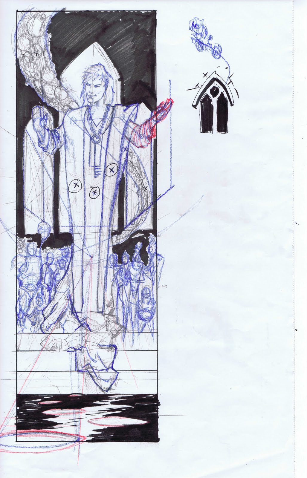
I mentioned on Friday that I've started a goal of tackling a different comic page every week. I'll be posting this first one (from Neil Gaiman's Sandman) on Friday.

------------------------------------------------------------------------

The recent earthquake, tsunami and nuclear catastrophes in Japan have been incredibly awful, surreal and beyond my scope of imagination. I really recommend, if you haven't, donating to the Red Cross. Every bit will help.

I've also found Rachel Maddow's recent segment on the nuclear reactors (and their possible meltdown) very smart and informative. With stuff this big and potentially destructive I find it helps me to listen to people that really know what they're talking about. Maddow explains everything that she can clearly and concisely, and the stuff that she can't she has other smart people on to talk about.

I'm a big fan of television that doesn't dumb itself down. Bravo Rachel Maddow Show.

------------------------------------------------------------------------

Your non-comic book recommendation of the week: Harold Bloom's "The Book of J". This fairly easy read (not always a given with the erudite Bloom) is an intriguing look at the the possible writer of the first 'version' of the Old Testament, and a commendable attempt to recreate that original first document as well.

These stories (if you'll forgive my referring to text sacred to millions of people as such) are so culturally embedded and almost unconscious remembered that it can be hard to look at them with a fresh, and in this instance literary, eye. Bloom has made a very strong case for the early works found in the Torah/ Old Testament as a beautiful piece of literature, and has taken them out of a moral context, something I would never have thought possible with the Bible.

--------------------------------------------------------------------------

Time to get a'crackin' on the day. Your art today comes from my comic page mentioned above. It's another rough, subject to change before I get to the finish line. I gotta say, I love the way the the colored pencil takes to the page. It's a nice, albeit temporary, change from the normal monochromatic palette the penciler (or inker) works in.

Enjoy!

Friday, March 11, 2011

Foto Friday!

It's the end of the week, and time's a'wastin'! Let's get this show on the road!

----------------------------------------------------------------------

I had a blast doing the one-off Batman page last week. I'm not that thrilled with how the page turned out (you live, you learn) but it was a nice switch-up to do a single page reinterpretation. I think it's something I'm going to try to work in to my (ab)normal routine.

Because, you know, between the blog, the baby and art I've got so much time. -sigh-

Ah well.

-------------------------------------------------------------------------

This week I'm doing a page from Neil Gaiman's Sandman. I'll save the page for later, but here's a snapshot of a panel. First my photo reference:


I used this pic (the guy, obviously) less for the face per se (it's a pretty easy angle and composition and tiny to boot) and more for the subtle, double light sourcing. Beautiful.

Here's what I'm working with so far:


See you next week!

Thursday, March 10, 2011

Egyptian Thursday!

Well, the week is a little bit over half done and there's work to be done yet! It's Egyptian Thursday, let's draw some mummys!

...or something...

----------------------------------------------------------------------

San Diego, contrary to popular belief, has actually been around as a big city for something close to a century now. It has its own share of buildings which in particular come from the Art Deco period, or to be more specific, a subset of the Art Deco period.

Art Deco, roughly the 1930's, was a design aesthetic which incorporated elements as disparate as clean geometry, human anatomy, the 'machine age' and a renewed interest (at least in the aesthetic sense) in pagan iconography, or rather non Greco-Roman pagan iconography. The last bit there combined with the discovery of the tomb of King Tutankhamen during that decade to form a variant of Art Deco, known as Egyptian Revival.

Egytpian Revival is more or less Egyptian-inspired buildings (sometimes architecturally or just ornamentally) combined with an Art Deco simplicity and geometric organization. It's a fun style, and one that (for obvious reasons) has been on my mind lately. San Diego has a good number of Egyptian Revival buldings and, it being San Diego, I took the opportunity to get out and do some quick sketching on location.

Fun stuff. Now I just gotta figure how to work them in to some pages...

(Oh, and ignore the marker bleeding through from the other side!)
---------------------------------------------------------------------

Wednesday, March 9, 2011

The Missing Ink!

Get it, the 'missing ink'.

-ahem-

Welcome to another installment of my new and improved art blog. I'm your host Alonso Nunez. It's Wednesday and that means it's time to 'sketch' a nice bit of inking (hopefully a nice bit of inking anyways) over some pencils (usually by another artist but sometimes over my own).

This week's selection comes to us from John Byrne. It's from Rough Cuts #1. Byrne has been in comics for over thirty years now, and his work on Fantastic Four and X-Men are considered among the finest runs those books have ever had. He's also had stellar runs on Alpha Flight, Avengers, and Superman, which is where this piece comes from.

-----------------------------------------------------------------------------

This is a splash page from The Man of Steel #6. It's fairly tight, as you can see above. By 'tight' I mean that the lines are all pretty defined, textures are discerned and line weights are present. This is one of those 'just don't mess it up' type of drawings. I'm going to see if I can have a little bit of fun with it.

The original was inked by Dick Giordano, one of the greats, and can be seen here.


-----------------------------------------------------------------------------


This was a lot of fun. A good inking exercise. I used only brush on this one (except for the 'S') and tried to just speed through it, reach for something a bit more spontaneous and organic. Like I said, fun.

Tuesday, March 8, 2011

Turnaround Tuesday!

(Intro if you're new: Turnarounds are a great way to get a feel for a character and to see if you can get a handle on their look and personality, even more than a pin-up. The fact that you're drawing them in three fairly static poses means that the defining elements of the character have to be displayed in small, subtle ways. And they're fun!)

This is a fun one this week; well, fun for me at least! It's a turnaround but also a character sheet for me. It's Cleopatra, but a very comic book Cleopatra.

As I've done research and preparatory sketches for an upcoming Egypt project, I've definitely tried to stay as close to history as possible. I'd like that project to have a decent amount of accuracy and consistency with the historical record. These upcoming sample pages however are a chance to cut loose a bit more. Here I can pull in some actual Egyptian design and costuming but also pull things from places like the Egyptian Revival movement (itself a subset of Art Deco) and comic books (I know, big surprise there, right?).

----------------------------------------------------------------------

Okay, here we go: This is Cleopatra. She's somewhere between an Egyptian Pharaoh, Jack Kirby's Big Barda and Elizabeth Taylor. Costume's possibly too busy. What do you think?

Monday, March 7, 2011

Manic Monday!

It's Monday, it's crazy, it's time to do some art!

Let's do this! Manic Monday, GO!

---------------------------------------------------------------------

Did you see my comic page that I posted up? It's my entry for a
So last week I mentioned the rather excellent Agent of S.T.Y.L.E. on Newsarama.com. I also linked to the first part of a few posts on the various Flash costumes over the years. Well, the next couple posts are up! And they are indeed excellent. Flash Fact: There's been some great costumes in the Flash universe, and there's been some awful costumes in the Flash universe. This series of articles covers them all. (Parts one, two and three are here, here and here) Enjoy!

---------------------------------------------------------------------

I've been looking at a lot of Alex Toth recently (shocking, I know) and I'm really convinced that he's one of the most important artists in comic history, right there with Kirby, Eisner and Wood. If you're looking for somewhere to get started, or looking for something new, you can do a lot worse than Creepy #139. It's a full issue of that classic magazine devoted to showcasing the work that Toth had done for the magazine up to that point.

It's an amazing book, maybe even more for the non-successes. It's fascinating to see the process of an artist so conscious and deliberate as Toth, and with works that aren't perfect I feel like you can see a bit more of his process and where he was coming from and where he was going. If that makes sense.

----------------------------------------------------------------------

Ancient Egypt continues to blow my mind. I've been watching some documentaries, and there's a lot that we still don't know or completely understand. Here's an adequate but not completely successful example: Picture the pyramids. Easy right? Big, colossal structures. Everyone can picture them, but did you know that they were all originally cased in limestone? The surface area would have been completely flush and gleamed light in the sun.

----------------------------------------------------------------------

Hey Internet friends! Here's a rough from a panel in the page that I finished last week. (Have you voted yet? Go here and read them rules! Really. You want your vote to count, don't you?) I'm usually not that into my roughs (not that I don't like them, just that I don't think that people are into seeing them much) but this one I thought was fun.

I think the markers help. Markers always help. Primary colors too.

And Batman. Always Batman.

(In my best James Brown) Uggghh!!!

----------------------------------------------------------------------


Sunday, March 6, 2011

Wacky Week (of 28 February)

So, this whole week was a blogging wash for me. Lots of stuff going on. Wife flew out to Texas for a conference, I was drawing when I could, and watching Lucia the rest of the time. Next week, it's back to your regular 'post a day' artblog by me, your host Alonso.

----------------------------------------------------------------------

That was the not fun part of this post; here's the good stuff. A blog I read on the regular, Comics Should Be Good, recently had a contest/ challenge where people could draw and submit their own comic page based on a Batman story that had already been published. Sounded like fun, so I took a crack at it. It's down below, but first...

They've got a vote going right now for the 'best' of the bunch. I would sure appreciate your vote my loyal readers. There's a link to the voting here. It's kinda specific, so I'll explain here. You post down in the comment section to vote. You'll rank your top five favorite pages (in order, may I humbly suggest my name near or at the top?), numbered 1-5. Include ACBC in your comment somewhere (that'll make it invisible, and a secret ballot) It's gotta have five choices, not just me-... I mean, your favorite. And it must must must have ACBC in the post, so that it's secret and counted.

Thanks in advance.

Here's my page