Tuesday, April 12, 2011

New Gods Page

So, the Green Lantern page that I started last week was taking a bit long. Which isn't, in and of itself, a problem, except for the fact that I'm trying to go a little quicker with these one-off pages. So... we're putting that one aside and moving on for now. I'll get back to it, sooner rather than later I'm sure. It's been fun so far, and I'll make sure to post it once it's done.

-----------------------------------------------------------------------

The new page I'm starting on is taken from a random DC comic from the early eighties, "Super Team Family". Catchy title, right? The cover is really what drew me in (no pun intended). Here it is, by artist extraodinaire Jose Luis Garcia-Lopez:


Great, right? It's actually way better than the art inside. The story is pretty basic. Orion of the New Gods is growing really, really big, and that's apparently really, really bad. Couple characters are trying to save him.

It's a serviceable plot, but the art is journeyman and doesn't bring much to the script. That's not a criticism of the art as such, just an observation that there's a lot of room in the work for more energy and individual artistic style.

----------------------------------------------------------------------

The next step was finding a page to work with. I chose one of the early ones. Two superheroes standing on an ever-expanding version of a third? I'm there!


----------------------------------------------------------------------

It's been a lot of fun so far. Here's a sample of the roughs (or some of them, at least). I've decided to go ahead and letter this one. I'll explain why as I wrap it up, some time in 2012.

Joking, joking...
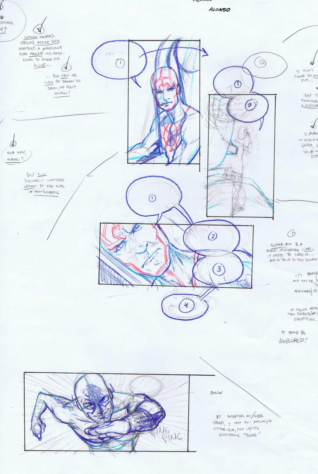


You can see all the panels from the original reflected in these roughs. There's some experimentation going on right now, so I've added stuff, taken out stuff and moved other stuff around.

Stuff.

See you tomorrow!

Monday, April 11, 2011

Manic Monday!

Well, we're almost on schedule (this post is only a few days late now, as opposed to a month!) Let's get crazy (put your hands up). It's Manic Monday!

-----------------------------------------------------------------------

It's the Inkwell Awards! Recognizing the best inkers in the comic industry. Have you voted yet?

-----------------------------------------------------------------------

Your song recommendation of the week: Danger Mouse and Daniele Luppi - "Two Against One (ft Jack White)". It comes from a Spaghetti Western inspired album titles "Rome" which is out later this year. It rocks. Hard. (YouTube link here)

----------------------------------------------------------------------

A month or so ago I started on a picture of Lucia as an Orange Lantern, which is a group of comic characters. (They're motivated by self-preservation and greed, and if that doesn't (sometimes) fit young kids to a tee I'm not sure what group does! Anyways, I wanted to do a more traditional caricature of her, so that's what we're doing today.

The photo was chosen by me, but Lucia insisted that she be Tinkerbell. In fact that was the second thing she said when she saw her Orange Lantern self ; "It's me!", was quickly followed by "I want Tinkerbell!".

Everyone's a critic!

So, here we are, and here's Lucia Nunez as Tinkerbell!

Tuesday, April 5, 2011

Sandman Page! (Wacky Week of April 4th)

[Updated]

Man, this was a beast!

I mentioned a couple weeks ago my intention to do a different comic page a week, just to keep different art muscles in shape. For my first one I selected a page from an issue of Sandman, Neil Gaiman's excellent and indispensable series. He worked with a host of collaborators on the book, and the arc that I drew (no pun intended) this page from was originally drawn by Kelly Jones, an excellent artist.

----------------------------------------------------------------------

I found the actual script for this page online, and so I was able to avoid 'starting' from where Jones had left off. It can be difficult, in the case of a very strong artist, determining your own blueprint. It can seem so natural, the storytelling choices that've already been made, and you run the risk of just reinterpreting the printed page, rather than drawing your own version of it. It's a fairly thin distinction but I believe it's a crucial one.

-----------------------------------------------------------------------

I am happy with how this turned out. The pencils are incredibly tight, but I wanted something that looked 'done'. I got to get a little Art Nouveau and P. Craig Russell (there's a large overlap between those two, really) in the art. It was a lot of fun.

Hope you like it. See you Monday!

-------------------------------------------------------------------------


---------------------------------------------------------------------

Update

Here's a link to the Comic Script archives. Look for Neil Gaiman, and the Sandman script's the only one listed for him. It's a Word doc; I used page 24, which is the very last one.

Friday, April 1, 2011

Foto Friday!

And...we're back!

In trying to keep moving forward, as I wrap up my Sandman page, I'm also starting on another.

Switching gears almost completely, I decided that this time I'd do a Green Lantern page. It's fresh in my mind, and perfect for this kind of thing; it's from a recent issue of Green Lantern Corps. It was originally drawn by Tyler Kirkham, an artist with very different sensibilities than I have. That made this very easy. I knew that (depsite the original being cohesive and energetic) I could find my own 'voice' for the page fairly easily.

-----------------------------------------------------------------------

It's in the early goings, but here's a panel that I've been working on:

First, some reference-


(There's also some photos of me grimacing, to get the lighting right, but it's much too early to embarrass myself that much. Sorry)

And here's what I've gotten from that-


---------------------------------------------------------------------

So far, so good I'd say.

See you next week!

Wednesday, March 30, 2011

The Missing Ink

As I wrap up my Sandman page (to be posted tomorrow) I thought I'd share a little bit more of my process.

-----------------------------------------------------------------------

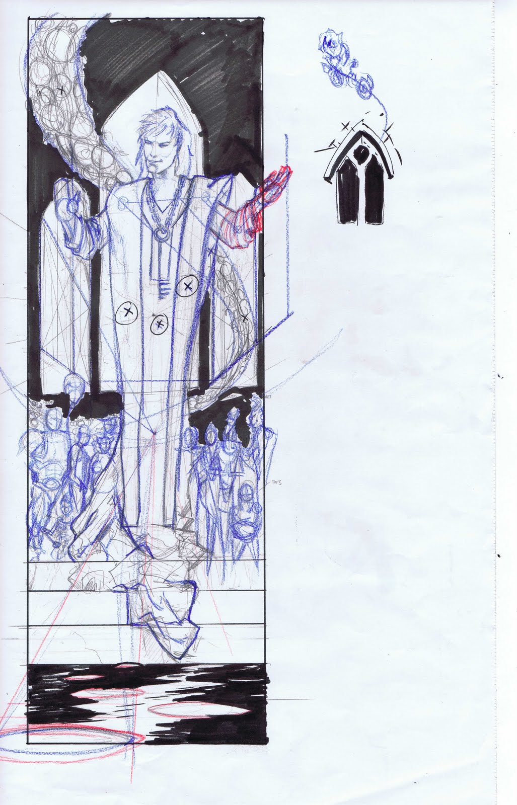
Sometimes, even with an image 'clear' in your head and a rough that's pretty complete, I find that it can be helpful to spot some of the blacks. That's a little bit of comic talk there, sorry; basically, what I'll do sometimes (and what I've done with the subsequent rough) is go in with a black marker, and determine some of the black areas or shadows ahead of the penciling stage. I find this can add a bit of cohesion to a panel that's lacking it.

I thought this panel was working, but I thought a little bit more of an 'oomph' could be wrung from it if I went for a little more heavy contrast in the lights and darks. Figuring out these lights and darks ahead of time obviously makes a lot of sense. I shudder at working through some of these problems on the board!

------------------------------------------------------------------------


My initial rough's in lead (grey) pencil, second step's blue and some fixes in red. I was initially going to do a little brickwork or something to make the building these characters are in look like a building, but I decided that the characters themselves should be the focus, and so I've reduced everything to a stark black-and-white.

See you tomorrow!

Tuesday, March 29, 2011

Turnaround Tuesday!

I started this one a few weeks back for St. Patty's Day, but various things got in the way. It's Banshee!

-----------------------------------------------------------------------

Banshee is one of the characters from the 'second wave' of X-Men which made its debut in 1974's "Giant Size X-Men" #1. (This group also famously included Wolverine, Storm, Nightcrawler and others) Banshee had made his debut in "X-Men" years earlier, as a hero forced into villainy by that dastardly Magneto.

He hung around for the first year or so of the 'new' X-men, but since then more or less remained in the background, or at least among the second tier of X-men.

-----------------------------------------------------------------------

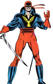
There's a fine line when designing vaguely nationalistic heroes. You can get either the 'clone of Captain America' look (see Captain Canuck, Germany's Vormund or Russia's Red Guardian) or you get the 'stereotype of the country as a costume' look (see Saudi Arabia's Arabian Knight, Spain's Aguila or -oy- Ireland's Shamrock). I think that the later is much easier to get wrong. Just look at them! Shamrock's name is even Molly Fitzgerald! Why not just name her Leprechaun O'Guiness?

Banshee somehow managed to stay out of that stereotyped caricature of a country 'zone'. I think it's because his name implies a connection with Ireland, without any implicit 'banshee' imagery, and his costume, in its green and yellow color scheme, says 'Ireland' without knocking us over the head with explicit flag imagery. He also tended to have subtle character traits that said 'Irish': curly, red hair, longer sideburns and a pipe. He walks on that tightrope, but I think it works.

The costume itself is great too. You've got a streamlined costume with just a collar for distinction; he's a flier and needs to stay unencumbered. And those wings. Man, I remember loving those crazy wings ever since I saw him in a comic back in the early '90's.

Great costume. I think I did a decent job here. Join me tomorrow for more art goodness!

------------------------------------------------------------------------

Monday, March 28, 2011

Manic Monday!

It's Manic Monday! You may have noticed that the last couple weeks were a bit of wash here at Pop/Life. I bit off.. not more than I can chew, but a piece that took a little bit longer to chew, if I can be allowed to stretch that metaphor to its legal limit.

I started trying to get done an extra comic page, in addition to my blog stuff and my usual motley crew of assignments, and it's taken a little bit longer than I'd anticipated to integrate into my schedule. Let's see if this week we can get back on track, yeah?

----------------------------------------------------------------------

It's no secret, here on this blog or to anyone that's talked to me for more than five minutes, that one of my absolute favorite comic artists is Kevin Nowlan. Nowlan is a thirty year professional in the industry, and he's one of those rare talents that's on the short list for mastery of penciling, inking, coloring and lettering. He's really, really good.

It's pretty rare anymore for him to take on penciling jobs (he's spent more time doing covers and stellar inking jobs over guys like Jose Luis Garcia-Lopez) but Mike Mignola, creator of Hellboy, has somehow lured him into doing a Hellboy one shot. This highly anticipated book is due next month. Kevin Nowlan's really gone all out on this one: he's doing the pencils, inks, letters and colors. I'm incredibly excited. Yay for comics!

There's a brief but interesting article over at Newsarama on the project (and dig those sweet pencils!)

------------------------------------------------------------------------

I don't know what I'd do if I didn't own an espresso machine, I really don't.

Okay, that's a lie. I'd go to the excellent Lestat's Coffehouse, here in Normal Heights. I'm just a block away, and I feel lucky.

-------------------------------------------------------------------------

I'm always interested in how other artists produce their work, and what steps they take and when. Along those lines, there's a great process article about a recent Venom cover by Joe Quesada over at Comic Alliance. Go check it.

-------------------------------------------------------------------------

So, the Sandman page I promised on Friday is not done yet. BUT. I've got a nice looking panel to show you! Last week (or the week before that, really) I posted a rough I was working on for the page. Well, the pencil-ness is done for that one. Here ya go!


See you tomorrow!